Visualisation#
- class portfolio_plan.visualisation.theme_rose_pine(variant: Literal['main', 'moon', 'dawn'] = 'main', geom_color: Literal['love', 'gold', 'rose', 'pine', 'foam', 'iris'] = 'love', base_size: int = 11, base_family=None)#
Bases:
theme_bwInitialize the Rose Pine theme with support for Main, Moon, and Dawn variants.
Parameters:#
- variant: str
“main”, “moon”, or “dawn” to select the color palette.
- color: str
Default geom color category. See category at rosé pine https://rosepinetheme.com/palette/
- base_size: int
Base font size.
- base_family: str
Base font family.
from plotnine import geom_line, ggplot, aes
from plotnine.data import economics

from portfolio_plan.visualisation import theme_rose_pine


p = (
    ggplot(data=economics, mapping=aes(x="date", y="unemploy"))
    + geom_line()
)

p
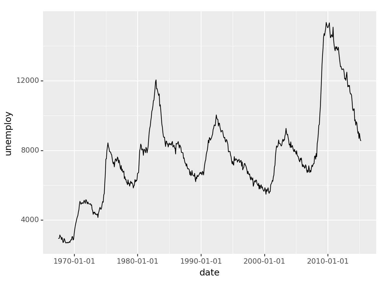
<Figure Size: (640 x 480)>
p + theme_rose_pine(variant="main")
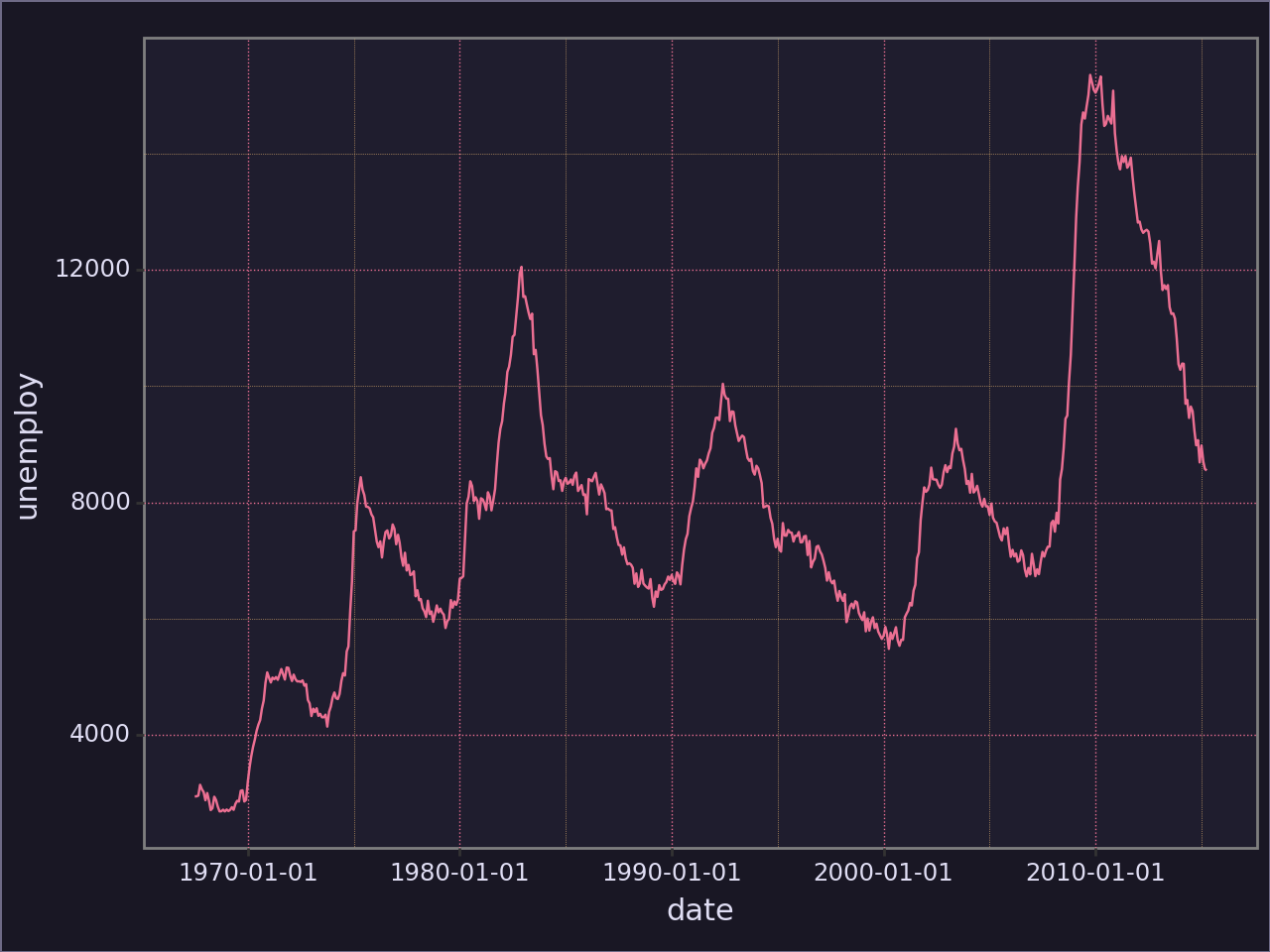
<Figure Size: (640 x 480)>
p + theme_rose_pine(variant="moon")
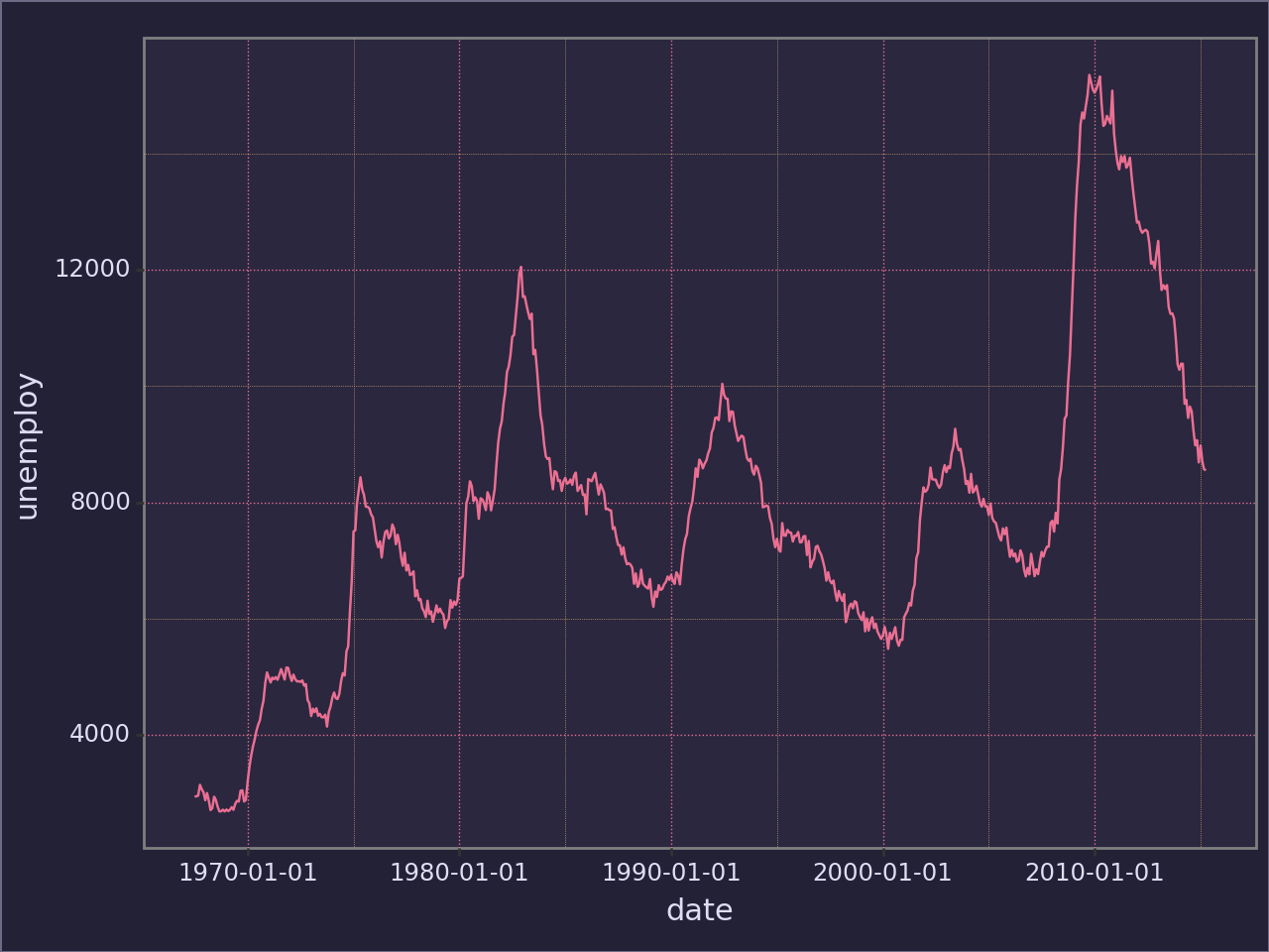
<Figure Size: (640 x 480)>
p + theme_rose_pine(variant="dawn")
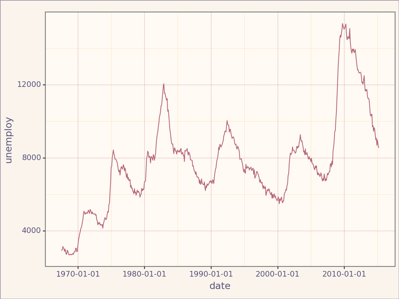
<Figure Size: (640 x 480)>
Custom Discrete Color Scales#
The Rose Pine theme also includes custom discrete color scales for mapping categories to colors. These scales are available for both color and fill aesthetics.
Example: Discrete Color Scale#
from plotnine import ggplot, aes, geom_point
import pandas as pd
from portfolio_plan.visualisation import scale_rose_pine_discrete

# Example data
data = pd.DataFrame({
    "x": [1, 2, 3, 4, 5, 6],
    "y": [10, 15, 20, 25, 30, 35],
    "category": pd.Categorical(["love", "rose", "gold", "pine", "foam", "iris"], ordered=True),
})

# Create a plot with the custom color scale
plot = (
    ggplot(data, aes(x="x", y="y", color="category")) +
    geom_point(size=5) +
    scale_rose_pine_discrete(variant="moon")
)

plot
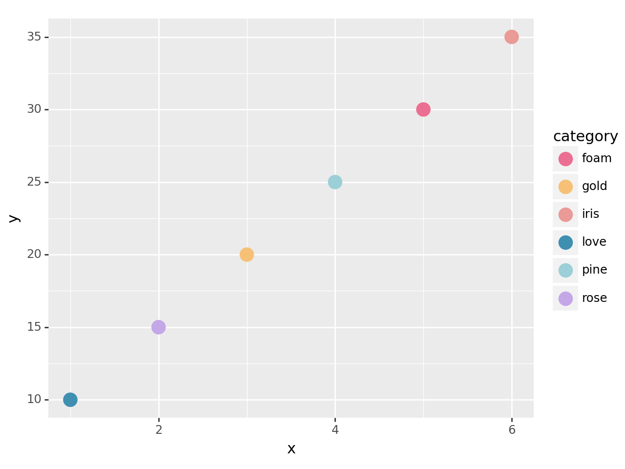
<Figure Size: (640 x 480)>
Example: Discrete Fill Scale#
from plotnine import ggplot, aes, geom_bar
import pandas as pd
from portfolio_plan.visualisation import scale_rose_pine_fill_discrete

# Example data
data = pd.DataFrame({
    "category": pd.Categorical(["love", "gold", "rose", "pine", "foam", "iris"], ordered=True),

    "value": [10, 15, 20, 25, 30, 35],
})

# Create a bar chart with the custom fill scale
plot = (
    ggplot(data, aes(x="category", y="value", fill="category")) +
    geom_bar(stat="identity") +
    scale_rose_pine_fill_discrete(variant="dawn")
)

plot
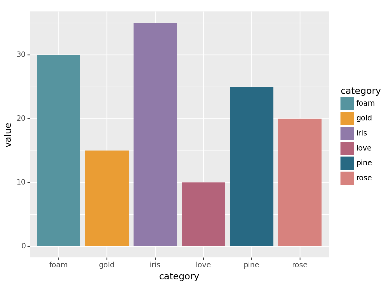
<Figure Size: (640 x 480)>
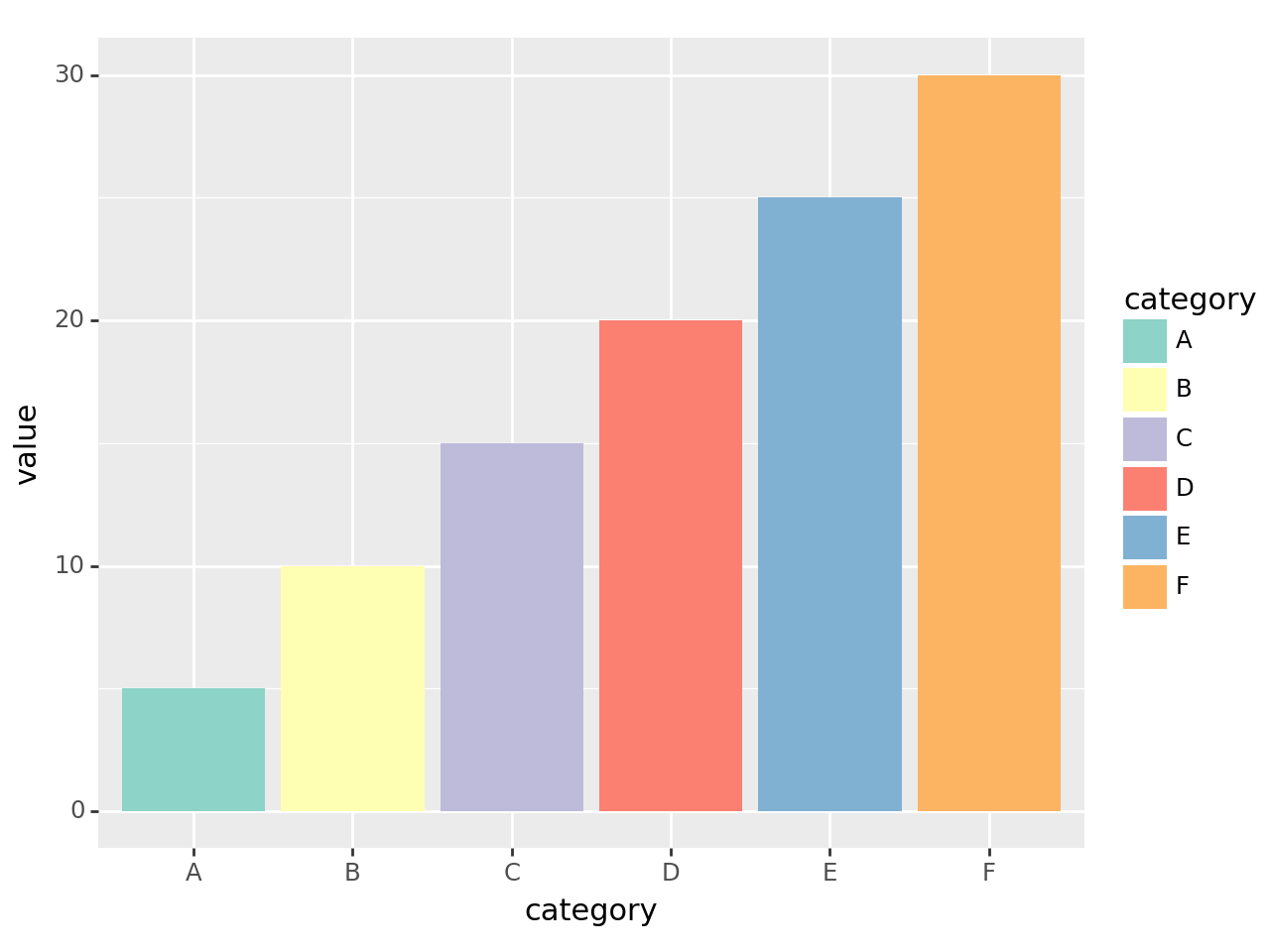
Example: Brewer Fill Scale#
from plotnine import ggplot, aes, geom_bar
import pandas as pd
from portfolio_plan.visualisation import scale_brewer_fill_discrete

# Example data
data = pd.DataFrame({
    "category": pd.Categorical(["A", "B", "C", "D", "E", "F"], ordered=True),

    "value": [5, 10, 15, 20, 25, 30],
})

# Create a bar chart with the brewer fill scale
plot = (
    ggplot(data, aes(x="category", y="value", fill="category")) +
    geom_bar(stat="identity") +
    scale_brewer_fill_discrete(palette="Set3")
)

plot
<Figure Size: (640 x 480)>